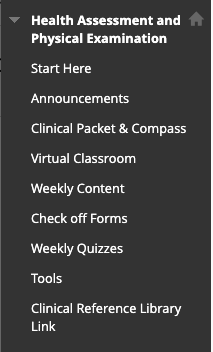
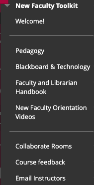
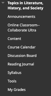
The course menu will be your students' main point of access to all the content and activities you've loaded into your course site. It also helps you quickly find materials. In addition, see our articles on Guidelines for Universal Accessibility and Required Syllabus Statements.
Note: this is only available in Classic-style courses. In Ultra-style, the main content page acts like the menu.
Guidelines
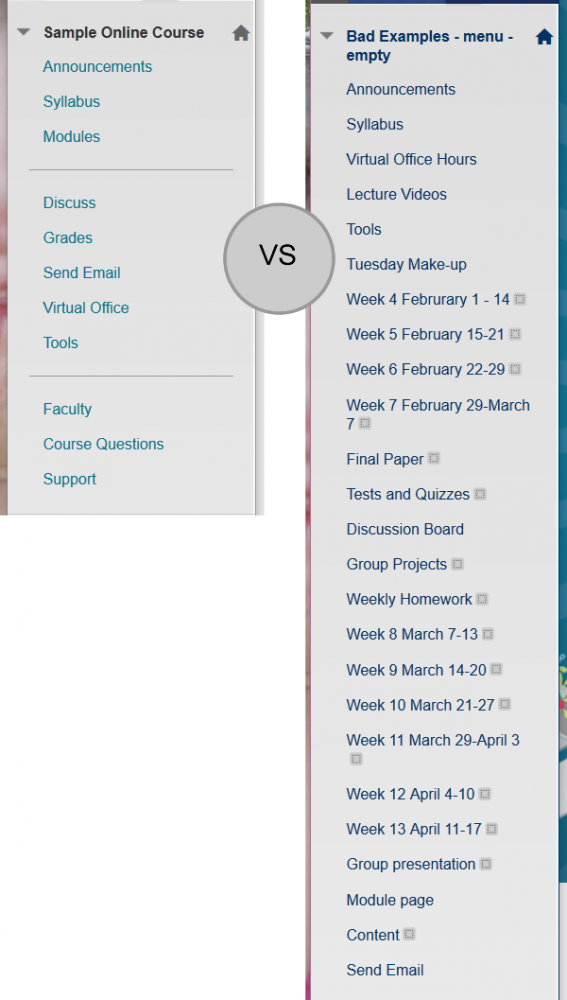
- To help improve the usability of your course menu, cluster menu items by type (put tools with tools, content with content, support with support) and make use of dividers and subheadings where it makes sense.
- At first, you may feel an urge to provide links in the course menu to all the content in your site. Tamp down this urge. An effective course menu balances linking students to key parts of the site that they will be using regularly while still being short and well organized.
- Outside of the syllabus, if your menu item has only one piece of content in it, does it really need to be a menu item? Are there other, related menu items (possibly containing only a couple pieces of content) that it should be grouped with?
- If your menu is running long, would it make sense to put a number of items together in folders under a single menu page?
Examples of successful course menus


