The Canva design platform provides many different options. This article focuses on the Text option.
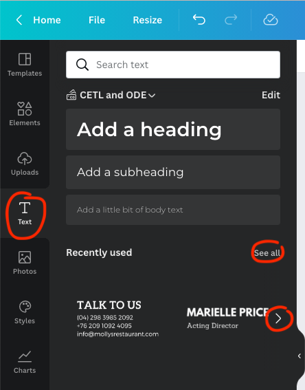
From your design canvas, select the Text button in the far left, black menu bar. This will expand the menu.
Based on what element you want to use, you click it to add it to your design. You can also choose the “See all” option or the arrow to the right in order to see more choices.

You can then change the font, size, color, etc. of your text.

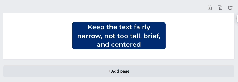
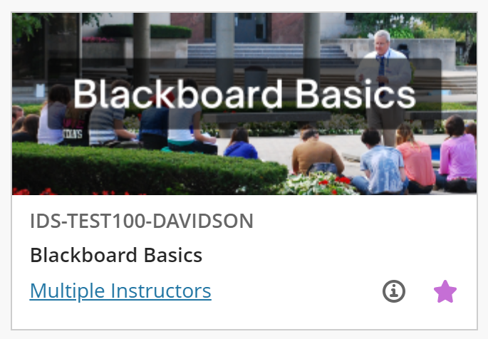
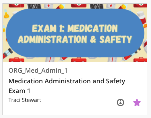
Make sure your text is legible in terms of font and size, but also color: avoid yellow and similar text to background color. For example, the first image below is quite hard to read. The second, with the solid-colored box behind the text is much more legible.


Blackboard banner notes:
- The text should be fairly narrow, not too tall, brief, and centered (see below).

- The full length of the banner will only be visible once the course is open. The course “card” on the main Blackboard Courses page, however, will only show the very center of the banner. Keep this in mind as you design your banner (see below for examples).
- If you will be adding text to your banner, say, the course name, make sure the text will be clear, legible, and centered. You can use an opaque or semi-transparent shape behind the text so that it stands out (see below for examples).

